
If you have decided that tracking sector rotation matters, that knowing which parts of the market are gaining strength and which are fading is worth your time, the next question is: what exactly do you look at?
Search for ‘sector rotation chart’ and you will find references to performance tables, heatmaps, relative rotation graphs, seasonality charts, and breadth indicators. They are not the same thing. They do not answer the same question. And using the wrong one for what you are trying to understand is a common reason investors find sector analysis confusing rather than clarifying.
This article is a plain-English walkthrough of four distinct types of sector rotation charts, what each one shows, what it cannot show, and which questions each one is best suited to answer. By the end, you will know which tool to reach for depending on what you are trying to understand about the market.
Why There Are Four Different Types and Why Each One Exists
Sector rotation is not one question, it is several. And different charts were built to answer different ones.
‘Which sectors have gone up the most recently?’ is a different question from ‘which sectors are building momentum right now?’ which is different again from ‘which sectors tend to do well in April and May historically?’ and completely different from ‘which sectors are gaining strength relative to the market and in which direction?’
Each of those questions has a chart type built to answer it. The confusion arises when investors use one chart type to answer a question it was not designed for — like using a returns table to understand momentum direction, or using a heatmap to understand historical seasonal patterns.
Here is the map:
| Chart Type | The Question It Answers | What It Cannot Tell You |
| Performance Table | Which sectors returned the most over a fixed period? | Whether that return is accelerating or fading; direction of momentum |
| Sector Heatmap | Which sectors have the most stocks in a strong or weak technical condition right now? | Historical context; whether today’s breadth is seasonal or structural |
| Seasonality Analysis | Which sectors have historically performed well in a specific month or quarter? | Whether the seasonal pattern is playing out this time; current momentum |
| Relative Rotation Graph (RRG) | Which sectors are outperforming the market, in which direction, and with how much momentum? | Absolute price levels; historical seasonal patterns |
None of these is the ‘best’ chart. Each is best for a specific type of question. The most informed approach to sector rotation uses all four in combination, which is exactly what we will walk through.
Tool 1: Performance Table: Where Every Investor Starts
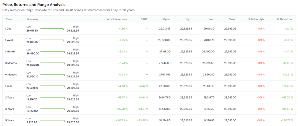
A sector performance table is the most basic sector rotation chart, and the starting point for almost every investor when they first think about sectors. It lists the major sector indices and shows their returns over a fixed period: 1 day, 1 week, 1 month, 3 months, 1 year, and so on. You can find this data for any index in the index technical section of the detail page. Check the data for Nifty Auto below.
What It Shows
At a glance, a performance table tells you the magnitude of returns across sectors for a defined time window. You can see that Banking returned 6.4% in June while IT fell 9.5%. You can rank sectors from best to worst for the quarter. You can see which sector has the highest 1-year return.
Where It Falls Short
A performance table is a backward-looking snapshot. It tells you what happened, not what is happening. A sector that returned 18% over the last three months may have peaked two months ago and is currently in decline, while a sector that returned only 4% over the same period may have just started an acceleration. The table shows the same aggregate number for both.
It also cannot tell you whether a sector’s strong performance is outperforming the market or simply rising with it. In a bull market where the Nifty 50 itself rises 12%, a sector returning 10% is actually underperforming the benchmark, but the performance table shows a positive green number and gives no indication of this.
When to Use It
Use performance tables for a quick orientation, to understand which sectors have broadly been in favour and which have not over recent periods. It is the correct first step, not the last one. Once you have the orientation, the other tools give you the depth.
Tool 2: Sector Heatmap: Reading Breadth at a Glance
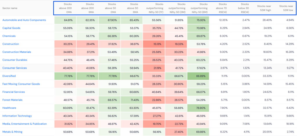
A sector heatmap moves beyond returns and into market breadth, showing what percentage of stocks within each sector are in a technically strong or weak condition. Instead of one aggregate return number per sector, a heatmap gives you a visual representation of how broadly the strength or weakness within a sector is distributed. On sharpely, you can find this in the sector analysis tool as shown below.
What It Shows
On sharpely’s sector heatmap, you can see metrics like the percentage of stocks in a sector trading above their 200-day moving average, above their 50-day moving average, or showing positive relative strength versus the Nifty 50. Each sector is colour-coded, darker green indicates broader participation in a move, darker red indicates broad weakness.
The critical insight a heatmap provides that a performance table cannot: is the sector’s move driven by a few large stocks or is it broad-based? A banking sector where only HDFC Bank and ICICI Bank are above their 200 DMAs while 80% of banking stocks are below it tells a very different story from a banking sector where 90% of stocks are above their 200 DMAs. The index return might look similar in both cases. The heatmap tells you which one is a genuine sector move and which is being carried by two large-caps.
Where It Falls Short
A heatmap shows you current breadth condition, a point-in-time reading. It does not show you direction of change. A sector with 70% of stocks above their 200 DMA could be improving (was 50% last month) or deteriorating (was 85% last month). The heatmap shows the same reading either way. You need historical context, or a different tool, to know which direction the breadth is moving.
It also carries no historical context about whether the current breadth reading is typical for this time of year or unusually high or low. For that, you need seasonality analysis.
When to Use It
Use the sector heatmap to validate a sector move. When a performance table shows a sector has been strong, check the heatmap to confirm the strength is broad-based. If the heatmap confirms wide participation, the move is more likely to be structural. If the heatmap shows narrow breadth despite strong index returns, treat the sector’s strength with more caution.
Tool 3: Seasonality Analysis: What History Says About This Time of Year
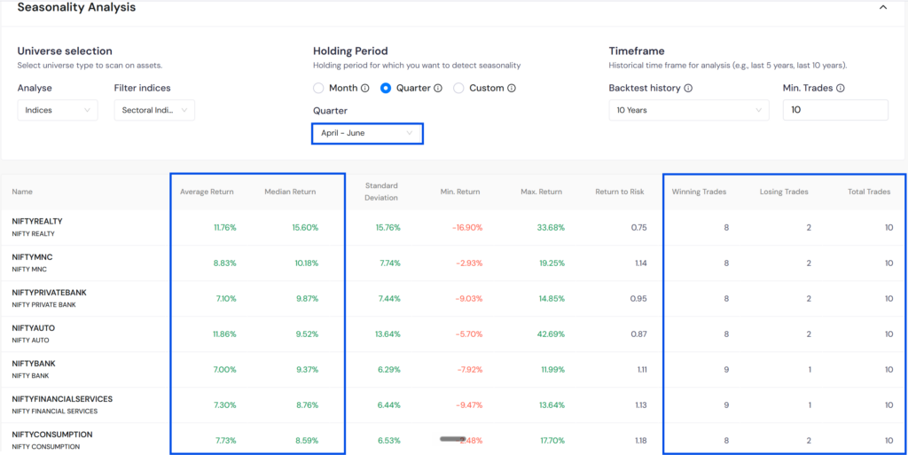
Seasonality analysis is a fundamentally different type of sector rotation chart from the first two. Where performance tables and heatmaps show you what is happening now, seasonality analysis shows you what has typically happened during this specific period in past years, and which sectors have historically been strong or weak in a given month or quarter. On sharpely, you can do this analysis with our Seasonality Analysis tool.
What It Shows
A index seasonality chart takes historical price data, typically across ten years and calculates the average return for each index across every month or quarter. The result is a historical pattern map: which sectors have, on average, outperformed during April-June, which have typically lagged in July-September, and which have shown consistent strength in October-December.
In the Indian market, some seasonality patterns are well-documented and logically grounded. Pharma and FMCG tend to be resilient in monsoon months when rural income uncertainty rises. IT and Banking tend to see result-season-driven moves in July and October. Infrastructure and Capital Goods have historically shown strength around budget season as government spending announcements arrive. Auto tends to see volume recovery in the festive season (October-November).
Seasonality analysis lets you check whether a sector’s current strength is consistent with its historical pattern for this time of year, or whether it is moving against the seasonal grain, which may indicate either a stronger-than-usual structural move or a false signal.
Where It Falls Short
Seasonality patterns are historical averages, not guarantees. A sector that has outperformed in April-June in 8 of the last 10 years will not outperform in every April-June going forward. Structural shifts in the economy, policy changes, and global macro events can override seasonal patterns entirely.
Seasonality also cannot tell you whether the current year’s pattern is already priced in. If every market participant knows that Pharma tends to do well in certain months, that expectation may already be reflected in valuations by the time those months arrive.
When to Use It
Use seasonality analysis as a probabilistic context layer, not as a standalone signal. When your performance table shows a sector is strengthening and your heatmap confirms broad participation, check seasonality to see whether this is consistent with the historical pattern for this time of year. If all three are aligned, current strength, broad breadth, and seasonal tailwind, the signal is more reliable than any one of them in isolation.
sharpely’s seasonality analysis is available as a paid feature, allowing you to check the historical pattern for any sector across specific months and quarters, and compare the current year’s performance against what history suggests for this period.
Tool 4: Relative Rotation Graph: The Most Complete Sector Rotation Chart
The Relative Rotation Graph (RRG) is the sector rotation chart that addresses the most fundamental question in sector analysis: not just which sectors have moved, or how broad the move is, or whether it is seasonal, but which sectors are outperforming the market benchmark, in which direction is that outperformance moving, and how quickly?
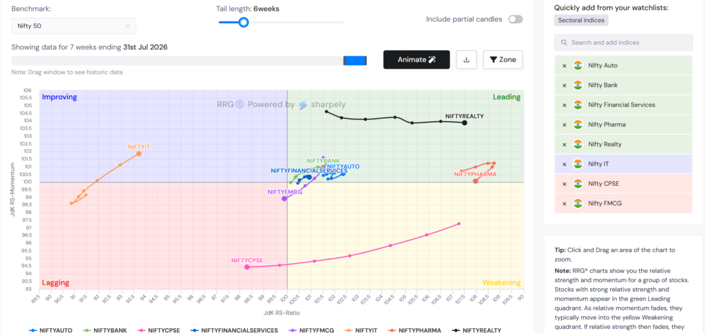
Where the first three tools give you snapshots, the RRG gives you trajectory. It is the difference between knowing a sector’s current position and knowing which direction it is heading.
What It Shows
An RRG plots every sector on a two-axis chart. The horizontal axis shows Relative Strength, whether the sector is outperforming or underperforming the Nifty 50 benchmark. The vertical axis shows Relative Momentum, whether that relative performance is improving or deteriorating. The intersection of these two axes creates four quadrants: Leading, Weakening, Lagging, and Improving.
Crucially, each sector on the RRG has a tail, a series of dots showing where the sector was in previous weeks. The tail shows the direction of travel. A sector moving from the Improving quadrant toward the Leading quadrant is building relative strength. A sector whose tail is curving from Leading toward Weakening is losing momentum even while it still outperforms. This directional information is what no other chart type provides.
The Four Quadrants: Plain English
| Quadrant | What It Means | Investor Implication |
| Leading (top right) | Outperforming the market and gaining momentum | Sector is in relative uptrend, strength confirmed |
| Weakening (bottom right) | Still outperforming but momentum fading | Monitor, sector may be topping relative to market |
| Lagging (bottom left) | Underperforming and losing momentum | Avoid or underweight. weakest quadrant |
| Improving (top left) | Still underperforming but momentum building | Early signal, potential rotation into leadership |
Where It Falls Short
The RRG measures relative performance, not absolute. A sector in the Leading quadrant is outperforming the Nifty 50, but if the Nifty itself is falling, that sector may still be declining in absolute price terms. The RRG tells you where to be relative to the market, not whether the market itself is a good place to be.
It also requires some familiarity to read correctly. A beginner looking at an RRG for the first time may find it more confusing than a simple performance table. The learning curve is real, but the payoff in analytical depth is significant.
When to Use It
Use the RRG as your primary sector rotation chart for ongoing monitoring, checking weekly which sectors are building relative strength (Improving to Leading trajectory) and which are fading (Leading to Weakening trajectory). It gives you the most forward-looking information of the four tools, because it shows momentum direction before the rotation is complete.
sharpely’s RRG tool under Pro Tools plots Indian sectoral indices against the Nifty 50 (or any other benchmark of your choice) on a weekly (or daily/monthly) timeframe with a 10-week tail, the optimal setup for actionable sector rotation analysis. You can also plot individual stocks, ETFs, and your watchlist names on the same chart, making it useful at both the sector level and the stock-within-sector level.
Using All Four Together: A Practical Workflow
Each tool answers a different question. Used in sequence, they give you a complete picture of a sector’s rotation status — present condition, breadth quality, historical context, and directional trajectory.
| Step | Tool | Question Being Answered |
| 1 | Performance Table | Which sectors have been strong or weak over recent periods? Start here for orientation. |
| 2 | Sector Heatmap | Is the sector’s strength broad-based or driven by a few large stocks? Confirms or questions the performance table signal. |
| 3 | Seasonality Analysis | Is the current strength consistent with the historical pattern for this time of year? Adds historical probability context. |
| 4 | Relative Rotation Graph | Which direction is the sector’s relative strength moving? The forward-looking confirmation or contradiction of everything above. |
A practical example of this workflow: suppose the performance table shows Pharma has been one of the better-performing sectors over the last month. The heatmap confirms that over 70% of Pharma stocks are above their 50-day moving averages, broad participation, not just a few names. The seasonality analysis shows that Pharma has historically tended to outperform in this quarter. And the RRG shows the Pharma sector dot in the Improving quadrant with a tail pointing northeast toward Leading.
All four signals are aligned. That convergence, strong recent returns, broad breadth, seasonal tailwind, and positive directional momentum, is a significantly more reliable signal than any single chart could provide alone. It is also the kind of signal that is impossible to construct if you are only looking at one type of chart.
Which Chart Should a Beginner Start With?
If you are new to sector rotation analysis, start with the performance table to build orientation, understand which sectors exist, how they differ in return profile, and which parts of the market have been in favour. This takes minutes and requires no specialist knowledge.
Add the sector heatmap once you are comfortable with the performance picture. The heatmap is visually intuitive, green means broad participation, red means broad weakness, and it immediately upgrades your understanding from ‘which sectors moved’ to ‘how broadly did they move’.
Introduce seasonality analysis when you find yourself asking ‘is this sector’s current strength unusual or typical for this time of year?’, because that is the exact question seasonality is built to answer. This is where the analysis becomes genuinely probabilistic rather than just descriptive.
Graduate to the RRG when you want to track rotation in real time, to see direction of momentum change before it is obvious in price data. The RRG has a learning curve, but it rewards the effort with the most forward-looking information of the four. If you have not already read our detailed guide on how to read an RRG chart, including the quadrants, the tail, and what counter-clockwise rotation means — that is the right starting point before opening the tool: [link to RRG explainer article].
Key Takeaways
There is no single ‘sector rotation chart’, there are four different tools, each answering a different question. Performance tables show magnitude. Heatmaps show breadth. Seasonality shows historical patterns. RRGs show directional momentum. Knowing which question you are asking determines which tool you reach for.
The performance table is the starting point, not the destination. Every sector rotation analysis begins with understanding recent returns, but stops there at its peril. Returns tell you what happened. The other three tools tell you why, how broadly, and what is likely coming next.
Breadth quality matters as much as index returns. A sector with strong index returns but narrow breadth, only a few large stocks driving the move, is more fragile than a sector with slightly lower returns but 80% of its stocks participating. The heatmap separates these two situations; the performance table cannot.
Seasonality adds probability, not certainty. A seasonal tailwind is not a buy signal. It is a probability weight. When current momentum and broad breadth align with a historical seasonal pattern, the signal is more reliable than when they diverge.
The RRG is the most complete sector rotation chart available. It combines relative strength and relative momentum on one chart, shows direction of travel via the tail, and gives you the earliest signal of a rotation forming — before the performance table, the heatmap, or the seasonality data fully confirms it.