
Most investors analyse sectors one at a time, checking how Banking performed, then IT, then Pharma, then comparing those numbers manually to decide where strength is building and where it is fading. It works, but it is slow, and it misses the most important dimension: how sectors are moving relative to each other, simultaneously, over time.
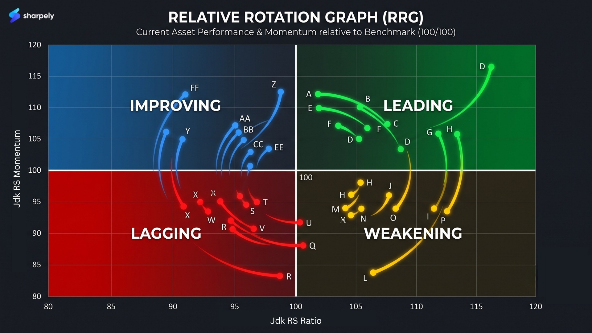
A Relative Rotation Graph (RRG) solves this. It places sectors, or stocks, or ETFs on a single chart that shows not just where each one stands today, but which direction it is heading. With one glance, you can see which sectors are leading the market, which are improving, which are deteriorating, and which are lagging, and crucially, which ones are about to rotate from one state to another.
This article explains what an RRG is, how to read every element of it, what the four quadrants mean in practice, and how to use rotation direction as an analytical tool, not just a snapshot.
What Is a Relative Rotation Graph?
The Relative Rotation Graph was developed by Julius de Kempenaer, the founder of RRG Research in the early 2000s and has since become a standard tool in institutional sector analysis. The concept is straightforward: instead of looking at absolute price performance, an RRG measures how each security is performing relative to a common benchmark, and then plots both the level of that relative performance and its momentum on the same two-axis chart.
The result is a visual map of the entire market, or any subset of it, where the position of each dot tells you its current strength, and the tail trailing behind each dot shows you the direction it has been travelling. You are not just seeing a static ranking. You are seeing movement.
The benchmark is the reference point everything is measured against. For sector analysis in the Indian market, the benchmark is typically the Nifty 50 or the Nifty 500. Every sector’s position on the RRG is determined by two questions: Is it outperforming or underperforming the benchmark? And is that relative performance improving or deteriorating?
The Two Axes: What They Actually Measure
Everything on an RRG flows from understanding the two axes. Get these right and the rest of the chart becomes intuitive.
The X-Axis: Relative Strength (RS Ratio)
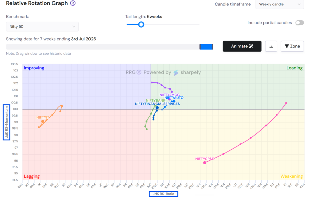
The horizontal axis measures Relative Strength, specifically, the JdK RS-Ratio which compares a security’s price performance to the benchmark over a defined period. A value above 100 means the security is outperforming the benchmark. A value below 100 means it is underperforming. The centre line at 100 is the dividing line between relative strength and relative weakness.
This axis tells you where a sector stands today relative to the market.
The Y-Axis: Relative Momentum (RS Momentum)
The vertical axis measures Relative Momentum, the JdK RS-Momentum, which captures whether the relative strength is improving or deteriorating. A value above 100 means the sector’s relative performance is getting better. A value below 100 means it is getting worse.
This axis tells you which direction a sector is heading.
The combination of the two axes is what makes the RRG powerful. You are not just measuring current strength, you are measuring the rate of change of that strength. A sector can be outperforming the market today (X > 100) but losing momentum (Y < 100), signalling it may soon rotate into underperformance. Spotting that rotation before it happens is the entire analytical value of the RRG.
PS: If you want to dig deep into how these values are calculated, then read a deep dive here.
The Four Quadrants: What Each One Means
The two axes divide the RRG into four quadrants. Each quadrant has a name, a colour, and a specific interpretation. Understanding these is the core of reading any RRG chart.
| Quadrant | Position | What It Means |
| Leading (top right) | RS Ratio > 100, RS Momentum > 100 | Outperforming the benchmark AND gaining momentum. The strongest quadrant. Sectors here are market leaders. |
| Weakening (bottom right) | RS Ratio > 100, RS Momentum < 100 | Still outperforming, but momentum is fading. A warning signal — the sector may be topping out relative to the market. |
| Lagging (bottom left) | RS Ratio < 100, RS Momentum < 100 | Underperforming AND losing momentum. The weakest quadrant — sectors here are the clear market laggards. |
| Improving (top left) | RS Ratio < 100, RS Momentum > 100 | Still underperforming, but momentum is building. A potential early-entry signal — the sector may be turning around. |
The typical rotation pattern — when it follows the classic cycle — moves clockwise: a sector improves from Lagging → Improving → Leading → Weakening → back to Lagging. This clockwise rotation is the baseline expectation, and it is why RRG analysts pay close attention when a sector breaks from that pattern.
Reading the Tail: The Most Important Element
Each dot on an RRG has a tail, a series of points showing where that sector was positioned over the previous periods (typically the last 6 to 10 weeks or months, depending on the timeframe selected). The tail is what transforms the RRG from a static snapshot into a dynamic story.
Three things to read from the tail:
Direction: Is the tail pointing toward the centre (weakening, heading toward underperformance) or away from the centre (strengthening, moving toward leadership)? The direction of the tail is a leading indicator of where the sector is going, not just where it is.
Speed: How long is the tail? A long tail means the sector has been moving quickly, strong momentum in one direction. A short, compact tail means the sector is moving slowly or consolidating. Speed matters because rapid rotations are often more actionable than slow drifts.
Curvature: Is the tail moving in a straight line or beginning to curve? A tail that is starting to curve clockwise — for example, a sector in the Improving quadrant whose tail is beginning to bend toward the Leading quadrant — is an early signal of an upcoming rotation. This is where experienced RRG readers find their edge.
When Rotation Goes Counter-Clockwise
The clockwise rotation is the standard pattern, but it does not always hold. Sectors sometimes move counter-clockwise — jumping directly from Weakening to Improving, for example, without passing through Lagging. Or from Improving back to Lagging without reaching Leading.
Counter-clockwise movement is often the result of a sharp, sudden event like a policy announcement, an earnings surprise, a macro shock, that accelerates a sector’s relative performance in either direction. It is worth flagging because it breaks the predictive value of the typical rotation cycle and requires a reassessment of the thesis.
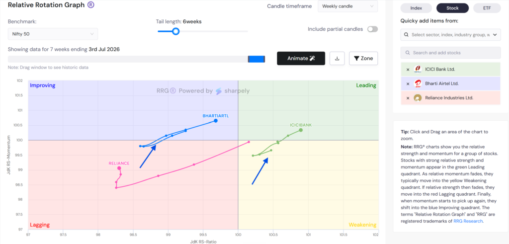
A sector that consistently moves counter-clockwise, never completing a full rotation may be range-bound in relative terms, neither building sustained leadership nor entering a sustained decline. That is a sector where timing the entry and exit is particularly difficult.
How to Actually Use an RRG in Practice
The RRG is an analytical tool, not a buy/sell signal generator. Here is how investors practically incorporate it into their process:
Identifying Sector Rotation Early
The most common use is spotting sectors that are moving from Improving to Leading, the early phase of a sector taking market leadership. At this point, the sector is still underperforming the benchmark (X < 100) but its momentum is strong and building (Y > 100 and rising). Investors who act on this signal before the sector crosses into Leading can position ahead of the crowd.
Avoiding Deteriorating Sectors
Sectors in the Weakening quadrant with long tails pointing toward Lagging are sending a clear message: relative outperformance is eroding. Even if the sector’s absolute price is not falling, it is losing ground to the broader market. For investors who benchmark their returns against the index, holding a Weakening sector with deteriorating tails is a drag.
Confirming Sector Themes
When a macro or thematic view aligns with an RRG signal, for example, a positive outlook on Banking coinciding with Banking sitting in the Leading quadrant with a tail pointing away from centre, the RRG provides technical confirmation of a fundamental thesis. The two together are more conviction than either alone.
Using Timeframe Layers
RRGs can be run on daily, weekly or monthly data. Weekly RRGs capture short-term rotations useful for tactical positioning. Monthly RRGs capture structural shifts, the kind that play out over quarters. Comparing the two timeframes is a useful discipline: a sector that is improving on the monthly but weakening on the weekly may be in a short-term pullback within a longer uptrend, rather than a true reversal. We suggest to avoid using RRG in the daily timeframe as sector rotation does not happen in days.
What an RRG Cannot Tell You
The RRG measures relative performance, not absolute. A sector sitting in the Leading quadrant is outperforming the benchmark, but if the broader market is in a sharp downtrend, that sector may still be falling in absolute terms. The RRG tells you where to be relative to the market, not whether the market itself is a good place to be.
It is also a lagging-to-coincident indicator by nature. The RS Ratio and RS Momentum are both derived from historical price data. They confirm trends that are already forming, they do not predict reversals before any price data supports them. The tail is a directional signal, not a guarantee.
Used correctly, the RRG is a filter and a confirmation tool, most powerful when combined with fundamental sector research and broader market context rather than used as a standalone system.
Tracking RRG Charts on sharpely
sharpely’s RRG chart is available under the Pro Tools section and is one of the more comprehensive implementations available for Indian markets. Beyond the standard sector rotation view, it lets you plot individual stocks, sectors, and ETFs on the same graph, giving you the flexibility to analyse a sector’s rotation at the index level and then drill into the specific stocks driving that movement.
You can also load the top 30 stocks by market cap from any sector, industry group, or industry directly onto the RRG, useful when you want to see which names within a sector are leading the rotation and which are lagging behind the group. For investors who maintain watchlists on sharpely, those watchlists can be loaded directly into the RRG, so the chart is always showing the stocks you are actually tracking rather than a generic universe.
The result is a tool that works equally well for sector-level rotation analysis and for stock-level relative strength work within a chosen theme.
Key Takeaways
An RRG plots relative strength and relative momentum on one chart. The X-axis shows whether a sector is outperforming or underperforming the benchmark. The Y-axis shows whether that relative performance is improving or deteriorating.
The four quadrants tell you the current state. Leading (strong and improving), Weakening (strong but fading), Lagging (weak and deteriorating), Improving (weak but turning). Each has a distinct interpretation and a different action implication.
The tail is the most important element to read. It shows direction, speed, and curvature, three things a single dot cannot. The tail is what makes the RRG a dynamic tool rather than a static ranking.
Rotation typically moves clockwise. Improving → Leading → Weakening → Lagging → Improving. Counter-clockwise moves are worth flagging as they signal something unusual is happening to the sector’s relative performance trajectory.
The RRG measures relative performance, not absolute. A sector in the Leading quadrant is outperforming the market — but if the market itself is falling, the sector may still be declining in price. Use the RRG in context, not in isolation.