
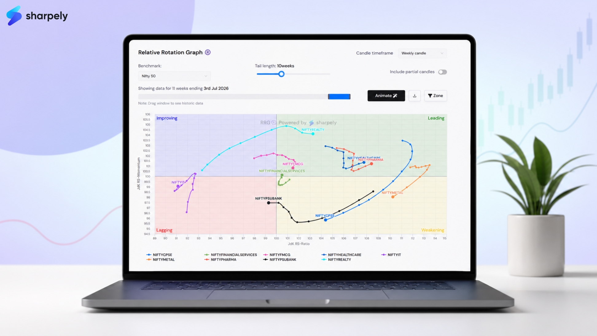
RRG (sector rotation) chart becomes genuinely useful the moment you move from understanding it in theory to reading it on a live market. The quadrants make sense on paper. The tail logic is straightforward. But when you open an actual RRG with ten Indian sector indices plotted simultaneously, tails overlapping, sectors scattered across all four quadrants, knowing what to look at first, and what it means for your portfolio, is a different skill entirely.
This article walks through that skill using a real snapshot of Indian sectoral indices on sharpely’s RRG tool. The sectors, positions, and tail patterns discussed here are grounded in an actual weekly RRG reading. The goal is not to give you a view on any specific sector, it is to show you, concretely, how to extract actionable insight from the chart in front of you.
If you have not yet read our RRG explainer covering what the chart is and how the quadrants work, start there first. This article picks up where that one ends.
Why Weekly Is the Right Timeframe for RRG Analysis
Before reading any RRG, you need to choose a timeframe. This choice matters more than most investors realise, and it is worth getting right from the start.
Daily RRG is noise. Individual sessions are too short to reflect genuine shifts in relative strength. A sector can show apparent momentum on a daily chart because of one day’s earnings release or news event — and reverse entirely the next session. Daily RRG tails are erratic, frequently misleading, and not a reliable basis for sector allocation decisions.
Monthly RRG is too lagging. By the time a rotation is confirmed on a monthly chart, the move is often already well underway. Monthly charts are useful for understanding the very long-term structural picture — which sectors have been in sustained leadership over quarters — but they are too slow to be actionable for most investors making real portfolio decisions.
Weekly RRG is the right balance. Each data point represents a full week of price action, which filters out daily noise while still being responsive enough to capture rotations as they are forming, not after they have completed. The tails on a weekly RRG with a 10-week look-back show you approximately two and a half months of relative strength history, which is enough context to distinguish a genuine trend from a one-week spike.
All the sector analysis in this article is based on a weekly RRG with a 10-week tail, benchmarked against the Nifty 50. This is the setup that gives you the clearest, most actionable read of where Indian sectors are in their rotation cycle.
Reading a Real Indian Market RRG: Sector by Sector
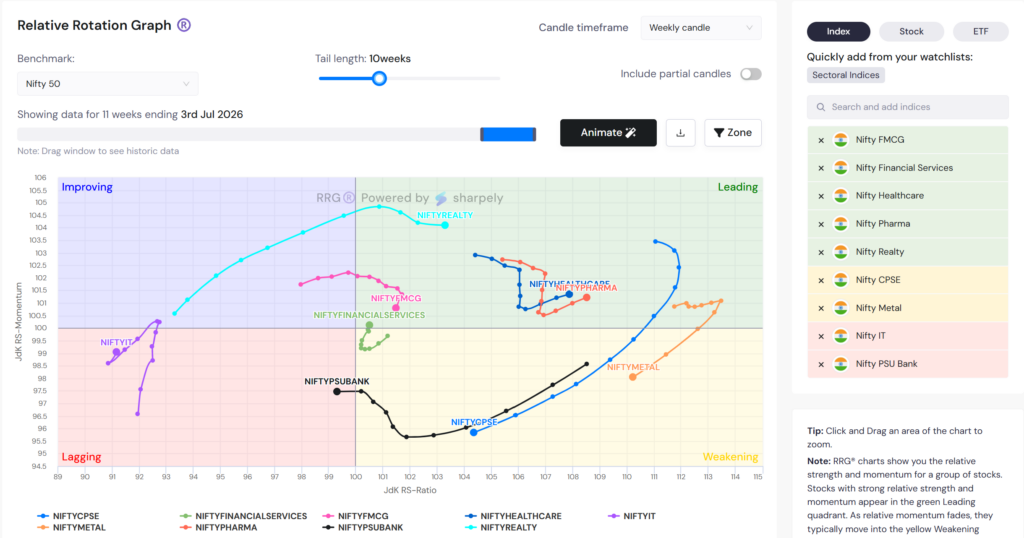
The chart we are working from shows ten Nifty sectoral indices plotted on a weekly RRG benchmarked against Nifty 50, with a 10-week tail. The sectors covered: Nifty Realty, Nifty Healthcare, Nifty Pharma, Nifty Metal, Nifty CPSE, Nifty PSU Bank, Nifty IT, Nifty FMCG, and Nifty Financial Services. Here is what each one is showing and what that means.
Nifty Realty: Leading Quadrant, Tail from Improving
Realty is one of the clearest reads on the chart. Its tail shows a long, sweeping arc that originated in the Improving quadrant. The sector was underperforming the Nifty but building momentum, and has since crossed cleanly into the Leading quadrant, where both RS Ratio and RS Momentum are above 100.
The arc of the tail is important here. It is not a sharp, sudden jump, it is a gradual, sustained curve. That kind of tail indicates a structural rotation, not a one or two week momentum spike. The sector has been consistently gaining relative strength over the 10-week period, and the current dot sits comfortably in Leading territory.
What this tells an investor: Realty is in a confirmed relative uptrend against the Nifty 50. The rotation was telegraphed weeks earlier when the tail was still in Improving, investors reading the RRG at that point had an early signal before the move was universally acknowledged.
Nifty Healthcare and Nifty Pharma: Leading Quadrant, Looping Tails
Both Healthcare and Pharma are sitting in the Leading quadrant, but their tails tell a more nuanced story. Both show a looping pattern, the tail traces a loop within the Leading quadrant, indicating that these sectors have been oscillating in relative strength rather than trending in a clean direction.
A looping tail in the Leading quadrant means the sector has been outperforming the Nifty, but not with consistent momentum. It strengthens, then weakens slightly, then strengthens again, cycling within a range rather than breaking out to sustained leadership. The most recent dot for both sectors is in Leading, which is constructive, but the loop pattern signals that this is not the same as a clean, extending tail.
The practical read: Healthcare and Pharma are holding relative outperformance but not accelerating it. They are sectors worth holding if you own them, but the looping tail suggests waiting for a cleaner, more extended move before adding aggressively.
Nifty Metal: Weakening Quadrant, Long Tail Heading Toward Lagging
Metal’s tail is one of the longest on the chart, which tells you the sector has been moving quickly. It extends far into the right side of the chart (high RS Ratio, meaning strong historical outperformance), but the most recent dots show the tail curving sharply downward into the Weakening quadrant, with RS Momentum now clearly below 100.
This is a textbook Weakening signal with momentum toward Lagging. The sector outperformed strongly, the long rightward tail shows that but relative strength has peaked and is now deteriorating. The velocity of the tail’s downward movement matters here: a sharp downward curve suggests the deterioration is happening quickly, not gradually.
The read: Metal has had its run of relative outperformance. The RRG is signaling that the leadership phase is ending. Investors holding Metal exposure should be watching this tail closely, if it crosses into the Lagging quadrant without reversing, the case for holding weakens significantly.
Nifty CPSE: Weakening Quadrant, Deep and Declining
CPSE (Central Public Sector Enterprises) shows a similar pattern to Metal but from a more extended position. The tail shows the sector was deep in the Leading quadrant not long ago, but has since rotated significantly into Weakening, with RS Momentum well below 100 and the tail pointing toward Lagging.
The distance the tail has travelled downward is a sign of how quickly the relative momentum has faded. A sector that was a strong market leader a few weeks ago and is now in the lower half of Weakening is undergoing a meaningful rotation, not a minor pullback in relative terms.
Nifty PSU Bank: Lagging Quadrant
PSU Bank has crossed into the Lagging quadrant, RS Ratio below 100 and RS Momentum below 100 simultaneously. The tail shows it arrived here via the Weakening quadrant, following the classic clockwise rotation from a period of leadership through weakening and into lagging.
The current dot sits near the border of Lagging and Weakening, which means the sector has not yet accelerated deeper into Lagging. Whether it stabilises here or continues lower in relative terms depends on whether RS Momentum begins to recover. At this point, the RRG offers no positive signal for PSU Bank, it is a sector to watch, not to add.
Nifty FMCG and Nifty Financial Services: Improving Quadrant, Near Centre
Both FMCG and Financial Services are sitting close to the centre of the chart, near the 100/100 intersection, with their most recent dots in the Leading quadrant. RS Ratio is slightly above 100 (still outperforming the Nifty) and RS Momentum is above 100
Being close to the centre means neither sector has strong conviction in either direction yet. But the direction of the tail matters. FMCG in particular shows a tail that has been consistently moving toward the centre from leading — a gradual but increasing weakness in relative momentum that is worth watching over the coming weeks.
The read: these sectors are not yet actionable as a RRG-based trade, but they are the ones to keep on the watchlist. If the movement continues and they cross into Leading, the rotation will be confirmed.
Nifty IT: A Case Study in Counter-Clockwise Rotation
Nifty IT deserves its own section because it illustrates one of the most important, and least understood RRG concepts: counter-clockwise rotation.
The standard RRG rotation cycle moves clockwise: Improving → Leading → Weakening → Lagging → back to Improving. This is the pattern that plays out when a sector’s relative strength builds gradually, peaks, fades, and recovers in an orderly cycle.
Nifty IT did not follow that path. Look at its tail on the weekly chart and you will see something unusual: the sector moved from Lagging directly upward into Improving, gaining RS Momentum without first gaining RS Ratio. And then the tail turned back counter-clockwise, retreating from Improving back toward the lower-left of the Lagging quadrant.
What caused this? The sector experienced a brief burst of relative momentum, likely driven by a short-term catalyst such as a rupee move, a global tech earnings beat, or a relief rally after a period of heavy selling, that temporarily lifted RS Momentum without the underlying RS Ratio (the longer-term relative strength) having actually recovered. The sector looked like it was beginning to turn. The tail pointed briefly toward Improving. And then the catalyst faded, and the sector rotated back.
This is exactly what counter-clockwise rotation looks like, and it is a trap that RRG readers must know how to identify. A sector that moves counter-clockwise from Lagging into Improving without a sustained improvement in RS Ratio is not genuinely recovering. It is experiencing a temporary momentum bounce within a still-weak relative trend. The counter-clockwise tail is the visual warning not to confuse a bounce with a rotation.
The discipline the RRG teaches in this situation is patience. Wait for the RS Ratio to also recover towards 100 before treating the move as a genuine rotation into Improving. Until both axes confirm the shift, counter-clockwise movement in a Lagging sector is a caution flag, not a buy signal.
Nifty IT’s tail is one of the most instructive examples of this pattern visible on an Indian market RRG in recent memory. It is the kind of real-world signal that textbook explanations of RRG often miss entirely.
The Full Sector Picture: Summary
| Sector | Quadrant | Tail Pattern | Key Read |
| Nifty Realty | Leading | Clean arc from Improving | Confirmed structural rotation. Strongest signal on the chart. |
| Nifty Healthcare | Leading | Looping within Leading/Weakening | Holding outperformance but oscillating. Hold, don’t add aggressively. |
| Nifty Pharma | Leading | Looping within Leading/Weakening | Same as Healthcare — sustained but not accelerating. |
| Nifty Metal | Weakening | Long tail curving sharply downward | Leadership phase ending. Watch for Lagging crossover. |
| Nifty CPSE | Weakening | Deep decline from Leading | Rapid fade from leadership. Rotation in progress. |
| Nifty PSU Bank | Lagging | Arrived via Weakening (clockwise) | No positive signal. Watch for stabilisation. |
| Nifty IT | Lagging | Counter-clockwise, bounced, retreated | Temporary momentum bounce within weak trend. Not yet a recovery. |
| Nifty FMCG | leading | Gradual northeast movement near centre | Early watch. Needs sustained crossing into Leading to confirm. |
| Nifty Fin. Services | Leading | Near centre, pointing dowanwards | Too early to act. Monitor next 2-3 weeks. |
Translating RRG Readings Into Portfolio Decisions
The RRG does not make decisions for you, it organises information so that your decisions are better informed. Here is how the readings above map to a practical investor framework:
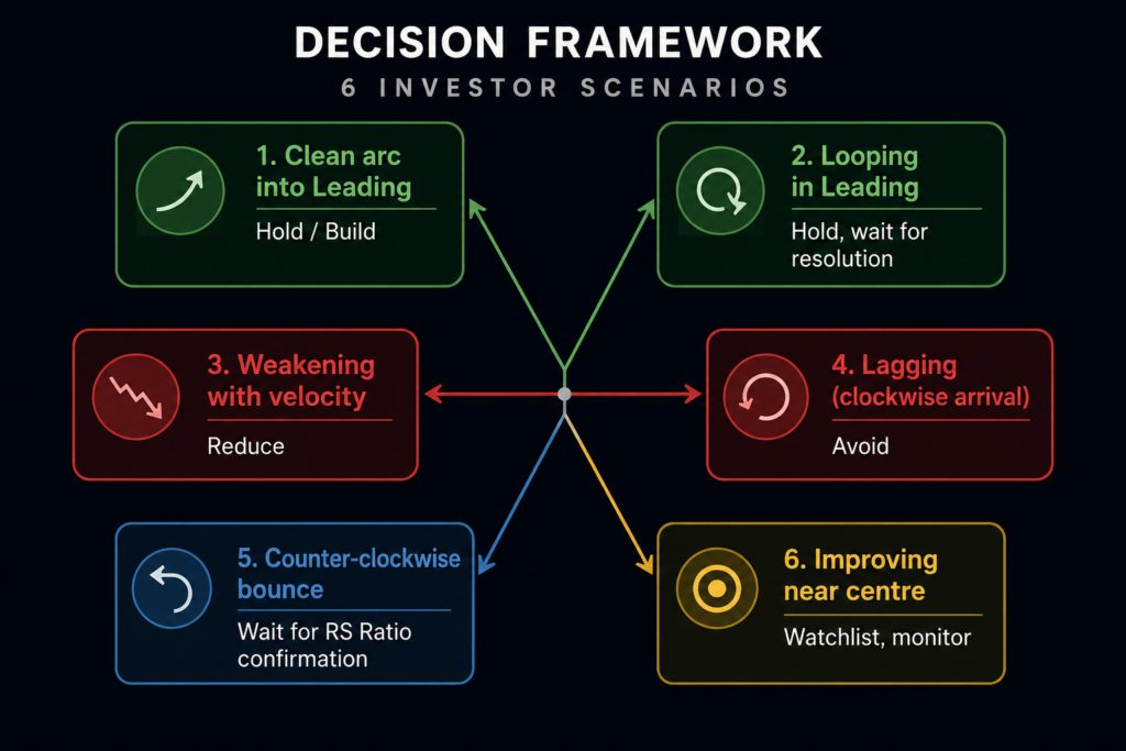
Clean arc into Leading (Realty): The structural rotation is confirmed. This is the quadrant where relative outperformance has the most runway ahead of it. The RRG supports holding or building exposure.
Looping in Leading (Healthcare, Pharma): The sector is outperforming but not with conviction. Hold existing positions. Wait for the loop to resolve into a clean, extending tail before adding. If the loop resolves downward into Weakening, treat it as a signal to reduce.
Weakening with velocity (Metal, CPSE): The leadership trade is unwinding. The longer and faster the tail is pointing toward Lagging, the more urgency there is to review exposure. This is a reduce signal, not a hold signal.
Lagging with clockwise arrival (PSU Bank): No RRG-based reason to hold. Watch for the RS Momentum to begin recovering before reconsidering.
Counter-clockwise bounce (IT): Do not mistake the temporary momentum uptick for a sector recovery. Wait for RS Ratio to also recover above 100 before treating this as an Improving signal. Until then, the underlying relative weakness is intact.
Leading near centre (FMCG, Financial Services): Early signal. Monitor over the next two to three weeks. If the northeast movement continues and the sector crosses into Leading, that is the confirmation to act on.
Running This Analysis on sharpely
The RRG chart used for this analysis is available under sharpely’s Pro Tools section. Set the benchmark to Nifty 50 (or Nifty 500), select Weekly candle, and set the tail length to 10 weeks, that is the setup that gives you the clearest read of where Indian sectors are in their rotation cycle without the noise of daily data or the lag of monthly data.
Beyond sector indices, sharpely’s RRG lets you plot individual stocks, ETFs, the top 30 stocks by market cap from any sector or industry group, and stocks from your own watchlists. Once you have identified a sector showing an early rotation signal, you can load that sector’s top stocks directly onto the RRG to see which names within it are leading the move and which are still lagging behind the group.
Key Takeaways
Weekly is the right timeframe for RRG analysis. Daily is noise. Monthly is too lagging to be actionable. Weekly with a 10-week tail gives you the right balance of responsiveness and reliability.
The tail tells the story, not just the quadrant. A clean arc into Leading (Realty) is a different signal from a looping tail in Leading (Healthcare). A sharp downward curve in Weakening (Metal) is more urgent than a slow drift. Read the shape and velocity of the tail, not just where the dot sits.
Counter-clockwise rotation is a caution signal, not a buy signal. Nifty IT’s counter-clockwise bounce from Lagging into Improving and back is the clearest illustration of this. Wait for RS Ratio to confirm before acting on apparent RS Momentum recovery in a Lagging sector.
The Improving quadrant is where early opportunities form. Generally you can find early winners of a new cycle by looking in the improving quadrant. Stocks or indices that are moving rapidly towards leading are the ones that have high momentum and gaining strength.
Use the RRG to confirm, not to replace fundamental research. The chart tells you what relative price momentum is doing. It does not tell you why. The most reliable trade setups combine an RRG signal with a fundamental reason for the sector’s relative strength to continue.