

Short tutorial on how to customize your terminal
Hello again!
Let’s continue our journey of creating a dashboard that fits your needs.
In the last article, we took a quick overview of Terminal, what it offers & saw how a pre-built dashboard is created.
In this article,
We will go in-depth into creating a dashboard from scratch and also see how to create your own ‘Chart Layout’. Let’s begin.
First, we assign a name to the dashboard. (In this case, we have kept it as ‘Demo’.)
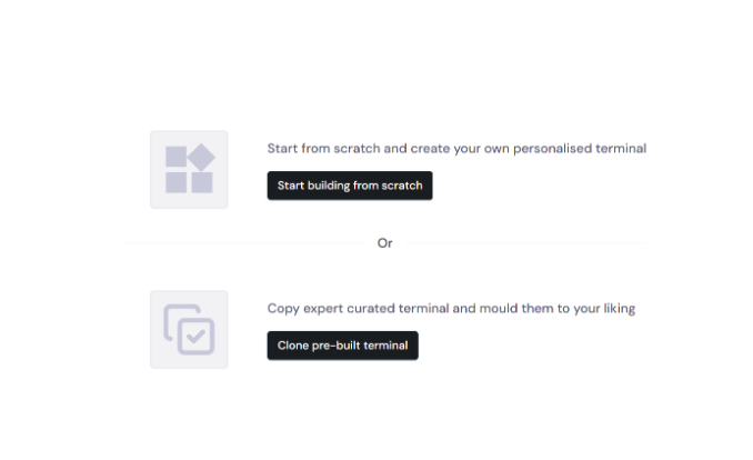
Next, click on ‘Start building from scratch.’ A screen like this will appear.
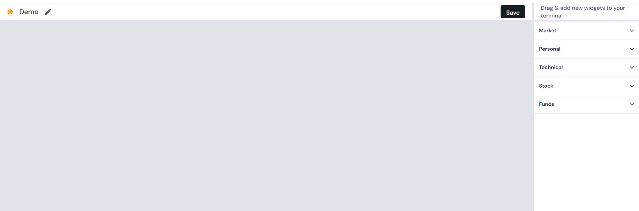
As you can see, the widgets are categorized under the following 5 categories.
- Market
- Personal
- Technical
- Stock
- Funds
Let’s quickly go through the widgets under each category
Market
- Market Watch
- Top Gainers
- Top Losers
- Near 52 Week High
- Near 52 Week Low
- Returns Heatmap
- Market Breadth
- FII/DII Activity
- Media & Corporate Announcements
Personal
- My watchlists
- My screens
Technical
- Technical chart
- Technical indicators
Stock
- Metrics
- Stylebox
- Metric charts
Funds
- Top funds
You now know what widgets are covered. Let’s see how the screen looks when you select a few from the above.
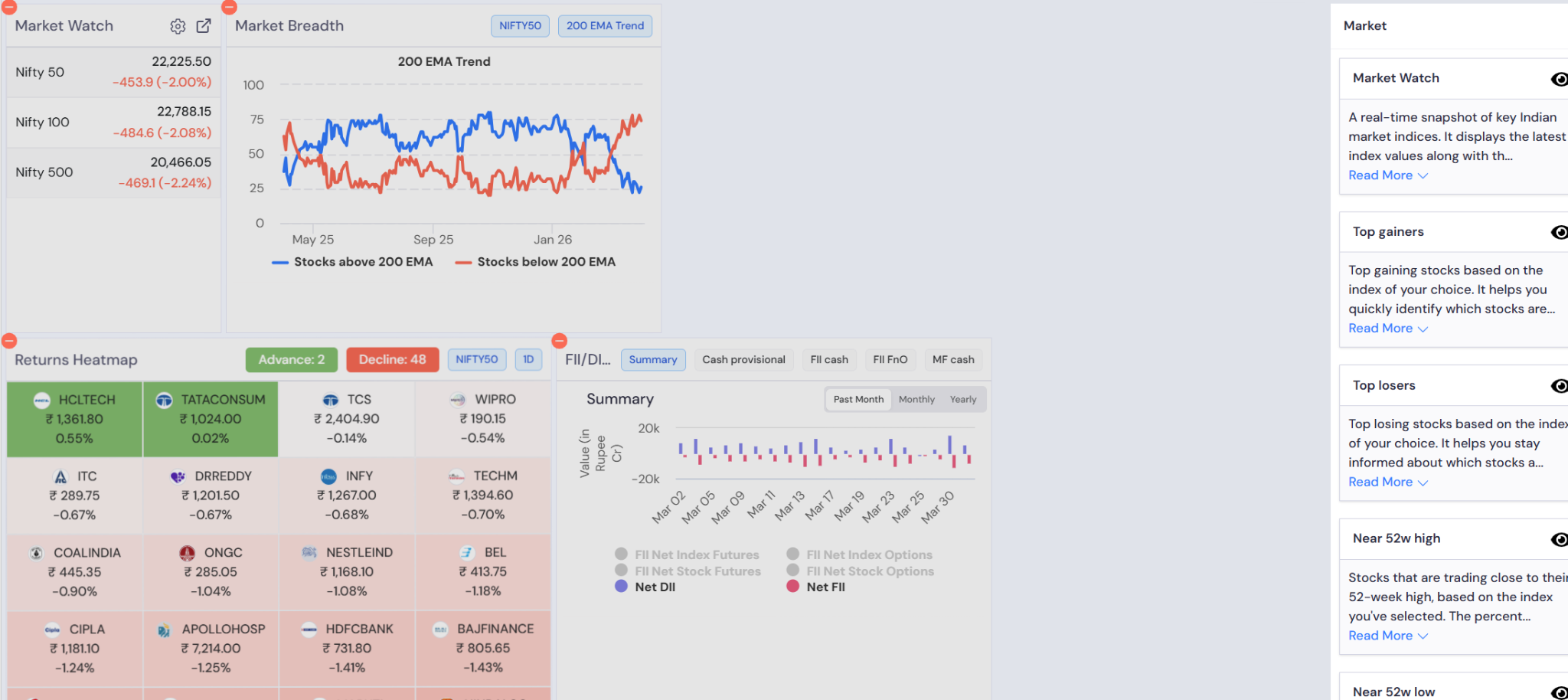
As you can see, the beauty of our customized terminal is that you can tweak and play around with the placements & size of the widgets and create a version that is not just easy on the eyes but also helps you quickly track all important things in one go!
Let’s take a look at the version when all the widgets are selected. See the image below.
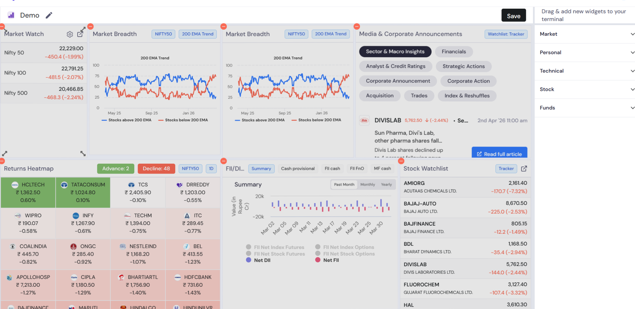
Our terminal is ready! Let’s hit save and see the final output now.
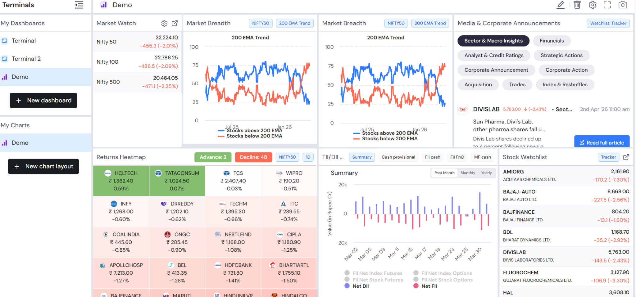
And there you go! A clean, quick & powerful terminal is ready for your purview.
Let’s now look at creating your own ‘Chart layout.’
Again, first we assign a name.
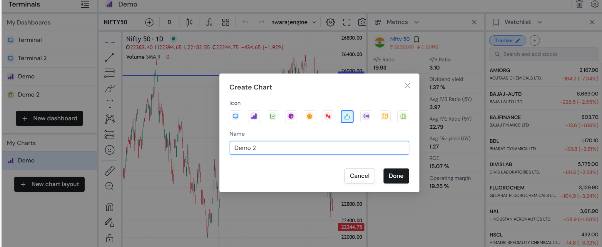
Check the image below to see the output.
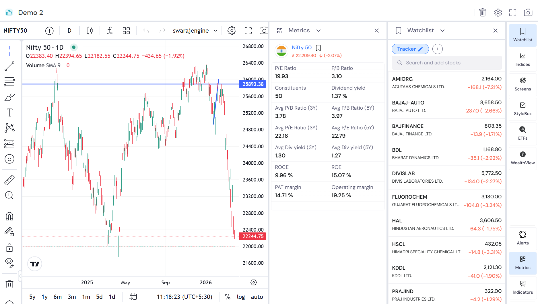
As you can see, your layout is ready & you can start analyzing, adding indicators, and keep a track of what’s happening with your watchlist of stocks fundamentally & technically– under one roof!
Go and start building your custom terminals & give us a shoutout on the socials if you loved this feature!