
Four times a year, most of the listed company in India files its earnings. Four times a year, markets reprice, sometimes violently based on whether those numbers met, beat, or missed expectations. And four times a year, most retail investors find themselves in the same position: reacting to headlines after the move has already happened.
A stock in your portfolio jumps 8% because you missed the results date. A sector you were watching quietly doubles its profit growth but you only find out two weeks later from a financial news article. A company you were about to buy reports a third consecutive quarter of revenue deceleration, and you did not know because you were not tracking it systematically.
Results season is not just a calendar event. It is the single most concentrated period of fundamental information flow in the investing year, and investors who have a repeatable, data-driven framework for tracking it have a genuine edge over those who do not.
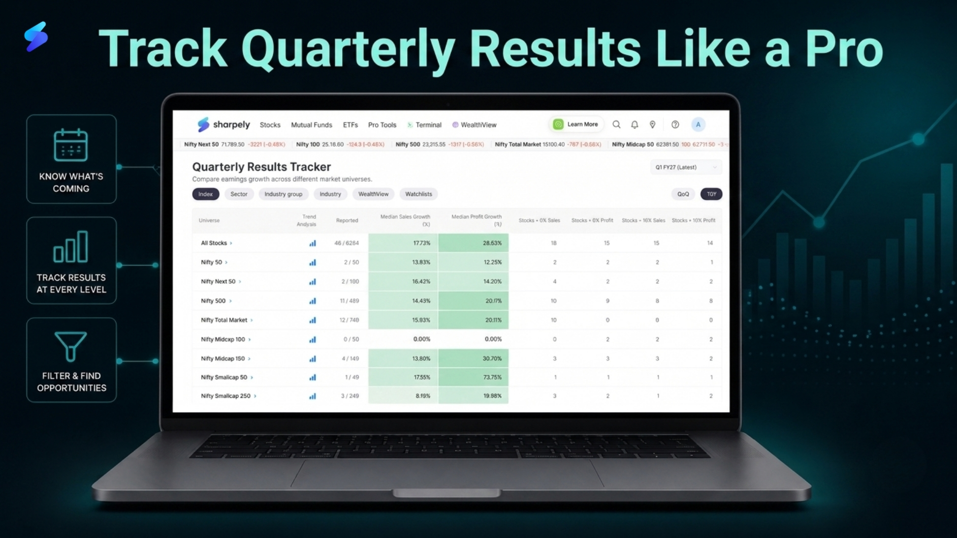
This article outlines exactly that framework. It covers three tools on sharpely: Event Calendar, Quarterly Results Tracker, and pre-built Earnings Screens, and shows how to use them together as a systematic process you can run every quarter, not just this one.
How Most Retail Investors Track Earnings And Why It Does Not Work
The typical retail investor’s results season workflow looks something like this: a company reports, financial news channels cover it, a hot take goes viral on social media, the stock moves, and the investor reacts. Either they buy because the headline said the results were great, or they sell because the stock fell and they do not know why.
This is a reactive, headline-driven approach to one of the most data-rich events in the investing calendar. And it has several specific problems.
You are always late. By the time a result is being discussed widely, the price has already moved. The investors who were positioned ahead of a strong result, or who got out before a weak one, were not smarter. They were more prepared.
You see one result in isolation. A single company’s quarterly numbers mean very little without context. Is its revenue growth better or worse than its sector peers? Is profit growth accelerating or decelerating from the previous quarter? Is the broader index growing faster or slower than your portfolio? Headlines never tell you this, you have to look it up yourself, or have a tool that surfaces it automatically.
You have no early warning system. Results season lasts three to four weeks. During that window, hundreds of companies report. If you do not know which companies in your watchlist or portfolio are reporting on which dates, you are constantly at risk of being surprised by a result that moves a stock you own.
The solution to all three problems is the same: stop consuming results reactively and start tracking them systematically. Here is how.
The Three-Step Framework for Results Season
A systematic approach to results season has three components, each corresponding to a specific tool on sharpely:
Step 1: Know what is coming (Event Calendar). Before results season begins, build your schedule. Know which companies are reporting, on which dates, and which ones matter most to your portfolio and watchlist.
Step 2: Track what is happening at every level (Quarterly Results Tracker). As results come in, analyse them systematically, starting at the index level to understand the broad picture, drilling into sectors and industry groups to find where earnings are accelerating or decelerating, and then going deep on individual companies. Crucially, benchmark your own portfolio’s earnings quality against the market.
Step 3: Act on the data, not the noise (Earnings Screens). Use pre-built screens that combine earnings quality with fundamental and technical filters to build a research shortlist from the strongest names in results season, not from what is trending on social media.
These three steps, run in sequence, give you a complete results season workflow. Each section below covers one tool in detail.
Tool 1 – Event Calendar: Never Be Caught Off Guard Again
The Event Calendar on sharpely is the starting point for every results season. It shows you exactly which companies are scheduled to report their quarterly results on which dates, across the entire listed universe, so you can plan your research schedule in advance rather than scrambling to react after results are already out.
What the Event Calendar Shows
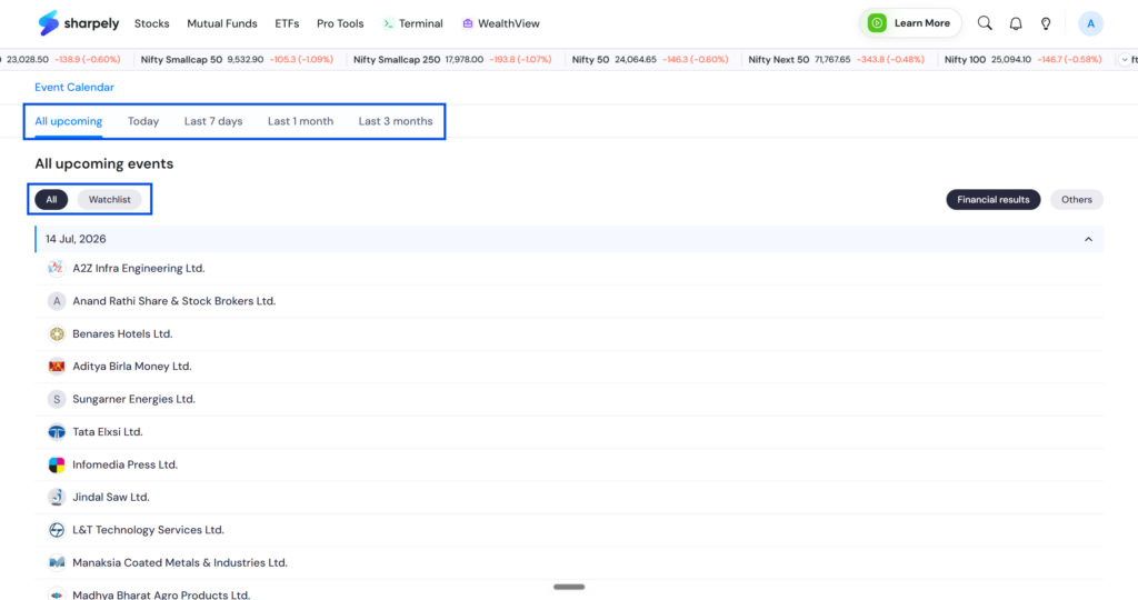
The calendar displays upcoming earnings dates company by company, with the ability to filter by date range. You can also narrow the view to only the companies that matter to you, that are in your watchlists.
How to Use It Effectively
At the start of results season, typically the first two weeks of July, October, January, and April, open the Event Calendar and run through two filters in sequence:
Filter 1: Your portfolio first. Search for every company you own. Note the reporting dates. For each company reporting in the coming week, set aside time to read the actual results filing, not a news summary, the filing itself. You should never be surprised by a result in a stock you own.
Filter 2: Your watchlist next. Companies you are watching but have not bought yet are often the most interesting results season opportunities. A company you have been researching that reports a significant earnings beat, or beat on revenue growth, with a strong technical setup is precisely the kind of situation a results season framework is designed to surface.
You should this tool weekly to generate the list of stocks whose earnings you will be tracking during the week.
What to Prioritise
Not every result deserves equal attention. Prioritise in this order: companies you own, large-cap bellwethers whose results affect sector sentiment (HDFC Bank, TCS, Reliance, Infosys, etc.), companies in sectors you are actively researching, and companies in your watchlist with upcoming catalysts. Everything else can wait for the weekly summary.
Tool 2 – Quarterly Results Tracker: The Full Drill-Down Framework
The Quarterly Results Tracker on sharpely is the centrepiece of a systematic results season approach. It organises earnings data across six levels: index, sector, industry group, industry, watchlists and adds a fifth layer that most investors never see: a benchmark comparison against your own portfolio’s earnings quality.
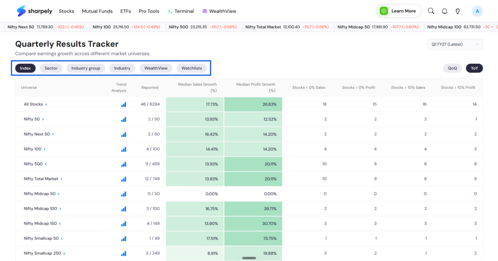
The drill-down framework is the key. You never start with an individual stock. You start broad and narrow down, so that by the time you are looking at a company’s specific numbers, you understand exactly what context those numbers belong in.
Level 1 – Index View: Understanding the Macro Earnings Picture
Start at the top. The Results Tracker shows you median sales growth and profit growth for the Nifty 50 and Nifty Midcap 150, both year-on-year and quarter-on-quarter, aggregated across all companies that have reported so far in the season.
This is the single most important number to establish first, because it sets the benchmark against which everything else is measured. If the Nifty 50’s median profit growth for the quarter is 10% YoY, that is the bar every company and every large cap will be compared against. A company growing profits at 10% is underperforming the index median. A company growing at 25% is significantly outperforming it.
Level 2 – Sector View: Finding Where Earnings Are Accelerating
Once you have the index-level baseline, break it down by sector. The Results Tracker lets you see median sales and profit growth by sector, so you can immediately identify which sectors are growing faster than the index median and which are below it.
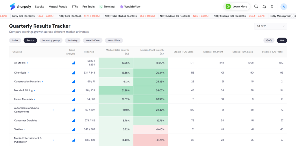
This is where results season starts to become actionable. A sector where median profit growth is consistently above the index median, and accelerating quarter over quarter. is a sector where the fundamental earnings tailwind is strong. That is a very different situation from a sector that looks strong in absolute terms but is actually decelerating from a higher base.
Pay particular attention to the YoY versus QoQ divergence at the sector level. A sector with high YoY growth but negative QoQ growth may be showing base effect, the YoY number looks strong because last year’s same quarter was weak. The QoQ number strips the base effect away and shows you the underlying momentum direction.
Level 3 – Industry Group View: The Granular Layer Most Investors Skip
Within every sector, different industry groups can perform very differently. The industry group view in the Results Tracker breaks sector-level data into its constituent groups, so within Banking, for example, you can see whether private banks, PSU banks, and NBFCs are all growing at the same rate, or whether the divergence within the sector is significant.
This layer matters because sector-level data can mask what is actually happening beneath it. A banking sector with strong aggregate median profit growth might be carried entirely by private banks while PSU banks are actually decelerating. A sector-level view would show you strong Banking numbers. An industry group view would show you the divergence, and tell you exactly where within Banking the earnings momentum is concentrated.
The industry group view is where informed stock selection begins. Once you know which industry groups within a sector are genuinely leading on earnings growth, you have a focused pool from which to identify specific names. You can do the same analysis at industry level as well
Level 4 – Individual Stock View: Deep Diving with Context
By the time you reach the individual stock level, you already know the index median, the sector median, and the industry group median. Now when you look at a specific company’s numbers, you have three benchmarks to compare against simultaneously.
The key questions at the individual stock level: Is this company’s revenue growth above its industry group median? Is profit growth above the sector median? Is the YoY growth rate improving or declining versus the previous two quarters? Is QoQ momentum positive or negative? Are margins expanding, stable, or contracting?
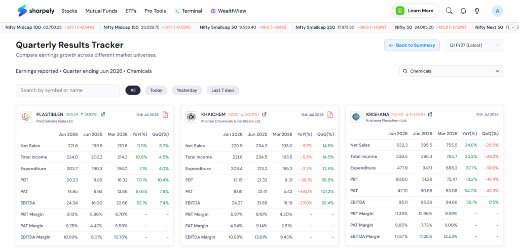
None of these questions can be answered in isolation. They only have meaning relative to the benchmarks you have already established by working through Levels 1, 2, and 3. This is precisely why the drill-down matters, individual stock numbers without context are just numbers.
Level 5 – Portfolio Benchmarking: The Most Underused Feature in Results Season
The Results Tracker allows you to compare your own portfolio’s median earnings growth against the median of all stocks giving you a composite view of your portfolio’s fundamental quality relative to the broader market.
This is a question most investors never ask during results season, and it is one of the most revealing: is my portfolio, as a whole, growing its earnings faster or slower than the index?
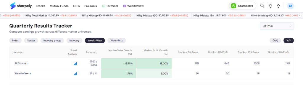
If your portfolio’s median profit growth is consistently below the median, you own a below-average portfolio from a fundamental earnings perspective, regardless of what the stocks have done in price. If your portfolio’s median growth is above the index, you are holding above-average businesses. And if your portfolio’s earnings growth is decelerating quarter over quarter while the index median is stable or accelerating, that is an early warning signal about the quality of the names you own.
Portfolio benchmarking during results season is not about making immediate buy or sell decisions. It is about maintaining an honest, data-driven assessment of the quality of your portfolio rather than relying on price performance alone as the proxy for quality.
Tool 3 – Earnings Screens: From Data to a Research Shortlist
The third tool is the one that converts results season data into an actionable research shortlist. sharpely’s pre-built Earnings Screens in the Super Screener combine earnings quality filters with fundamental and momentum criteria — so the output is not just a list of companies that reported good results, but a filtered list of companies where strong results coincide with the right fundamental and technical setup.
Why Standalone Earnings Data Is Not Enough
A company can report excellent quarterly results and still be a poor investment at that moment — if the stock is already pricing in several years of strong growth, if the balance sheet carries excessive debt, or if the price is so far extended from key moving averages that the risk-reward for a new entry is poor.
The earnings screens solve this by layering multiple filters simultaneously. A typical results season screen on sharpely might combine: Sales growth YoY above a threshold, Profit growth YoY above a threshold, QoQ growth positive on both revenue and profit (confirming momentum is not just a base effect), Market cap above a minimum (ensuring liquidity), and price within a defined range of its 52-week high (ensuring the stock is in a confirmed uptrend, not in a technical breakdown despite good results). We have covered three of these screens in detail in a separate article — [link to results season screens article].
How to Clone and Customise a Screen
sharpely’s pre-built screens can be cloned (copied) into your own account and modified. This is the recommended approach rather than building from scratch. Start with a published screen that matches your general criteria, clone it, and then adjust the specific thresholds to match your own investment style.
Here are three screens that you can use to find strong stocks during a result season.
How to Interpret the Screen Output
The output of a results season screen is a starting point for research, not a buy list. Every stock that passes the filters has cleared a defined set of objective criteria, but that is the beginning of the analysis, not the end.
For each stock in the screen output, the next steps are: read the actual quarterly results filing, understand the revenue and profit drivers, check management commentary for guidance on the next quarter, assess the balance sheet for debt levels and cash generation, and look at the chart for a clear entry setup.
The screen does the first round of filtering across thousands of companies in seconds. The research work is still yours to do, but now you are doing it on a focused, pre-qualified list rather than starting from scratch.
The Complete Results Season Workflow: How All Three Tools Fit Together
Used individually, each tool adds value. Used together in sequence, they create a results season process that is repeatable, systematic, and genuinely better than anything you can achieve through news consumption alone.
| Step | Tool | What You Do | What You Get |
| 1 | Event Calendar | Before results season: filter by portfolio, watchlist, then sector/index. Note all reporting dates. | A forward-looking schedule, no more surprises from stocks you own or watch. |
| 2 | Results Tracker: Index | As results come in: check broader market indices’ median sales and profit growth (YoY + QoQ). | The market baseline. The number every sector and stock will be measured against. |
| 3 | Results Tracker: Sector | Break the index view down by sector. Identify sectors above and below the index median. | A sector-level earnings map, where growth is accelerating vs decelerating. |
| 4 | Results Tracker: Industry Group | Drill into the sectors of interest. Find which industry groups within each sector are leading. | Granular focus, avoids the trap of sector-level data masking intra-sector divergence. |
| 5 | Results Tracker: Stock | Deep dive on specific companies with three benchmarks already established. | Contextualised stock analysis, numbers that mean something because you have the comparison points. |
| 6 | Results Tracker: Portfolio | Compare your portfolio’s median growth against the Nifty 50 median. | An honest quality check on your own holdings, not just price, but underlying fundamentals. |
| 7 | Earnings Screens | Run pre-built screens to find companies combining strong results with the right fundamental and technical setup. | A pre-qualified research shortlist, filtered from thousands down to the names worth your time. |
The full workflow takes discipline to run consistently, especially in the middle of a busy results season when there is constant noise competing for your attention. But the investors who run it every quarter build something that reactive, headline-driven investors never accumulate: pattern recognition. Over time, you begin to see how sectors move through earnings cycles, which industries tend to deliver consistent growth versus which are more volatile, and which types of companies in your portfolio hold up best when the broader earnings picture is weak.
That pattern recognition is the compounding return on the habit of tracking results systematically. It does not show up in one quarter. It shows up across years.
A Framework for Every Quarter, Not Just This One
Results season is one of the most predictable, recurring opportunities in the investing calendar. It happens four times a year, every year, on roughly the same schedule. The companies reporting, the sectors covered, and the analytical framework required are the same every time.
The investors who treat it as a systematic process, with a schedule, a drill-down framework, and a research workflow, consistently extract more signal from the same public information than investors who rely on news consumption. Not because they work harder, but because they work with a structure that converts raw earnings data into genuinely useful insight.
The three tools on sharpely, Event Calendar, Quarterly Results Tracker, and Earnings Screens are designed to support exactly that structure. Each solves a different problem: knowing what is coming, understanding what it means at every level of the market, and converting the best of what you find into an actionable research shortlist.
Run this framework this quarter. Run it next quarter. The process does not change. The data does, and that is exactly the point.